METHODOLOGY
How to Use Stage Analysis to Identify Stocks in an Uptrend
A strong Stage 2 case reads a weekly chart as a body of evidence: price above a rising 30-week simple moving average, sustained strength near the upper end of its recent range, and constructive price and volume behavior. That can identify a possible advance; it does not tell you whether today's price offers a sensible entry.
BY TRADEREGIMEN EDITORIAL / PUBLISHED / UPDATED · 8 MIN READ
A stock closes one week above its 30-week moving average. The chart now looks better, but that single crossover does not establish an uptrend. The average may still be flat or falling, price may be stuck in the middle of a wide range, and the move may have no participation behind it.
Stage Analysis is most useful when it slows that conclusion down. It gives the broader trend a name, then asks you to inspect the evidence behind the name before evaluating a setup, entry, stop, and position size separately.
Price above the 30-week average is one condition. Stage 2 is the stronger case that an advance is already underway.
The four stages describe context
The framework popularized in Stan Weinstein's 1988 book divides a stock's longer-term price cycle into four stages. Real charts do not move through them on a tidy schedule, and transition periods can stay ambiguous for weeks.
| Stage | Plain-language label | What the weekly chart suggests |
|---|---|---|
| 1 | Basing | Price is stabilizing after a decline while the long-term average flattens. |
| 2 | Advancing | Price is holding above a rising long-term average and sustaining an uptrend. |
| 3 | Topping | The prior advance is stalling while the long-term average loses direction. |
| 4 | Declining | Price is below a falling long-term average and the broader trend is down. |
Labels such as basing and toppingdescribe the model's reading of price and volume. They do not prove that institutions are accumulating or distributing shares, and they do not predict what the next bar will do.
A practical Stage 2 checklist
- Start with the weekly chart. Stage Analysis is meant to describe the broad trend, not an intraday move.
- Locate price relative to the 30-week average. A possible Stage 2 normally holds above it. Here, 30-WMA means a 30-week moving average, not a weighted moving average.
- Check the direction of the average. Rising carries different information from flat or falling. A crossover above a flat line can still be a range-bound chart.
- Look for persistence. Several weekly closes above the average are stronger evidence than one temporary break.
- Check where price sits in its recent range. An advancing stock should be making progress toward the upper end, not merely bouncing in the middle of a damaged structure.
- Use volume and relative strength as separate lenses.Participation can support the move, while relative strength asks whether the stock is outperforming its benchmark or comparison universe.
- Evaluate the trade after the trend. A Stage 2 chart can still be extended, illiquid, close to earnings, or too far from a defensible stop.
Why the slope matters
A simple moving average smooths past prices, which makes its direction useful for describing an established trend and necessarily late when a trend changes. That lag is not a flaw to hide; it is the tradeoff for filtering some daily noise.
The hardest charts sit near a transition. Price can cross above a flat average several times without leaving the range. Calling every crossing Stage 2 turns a trend framework into a short-term signal and creates the exact ambiguity the weekly view is supposed to reduce.
Two hypothetical candidates, one misleading shortcut
Both fictional candidates below trade above their 30-week simple moving average. Only one has a coherent Stage 2 evidence stack.
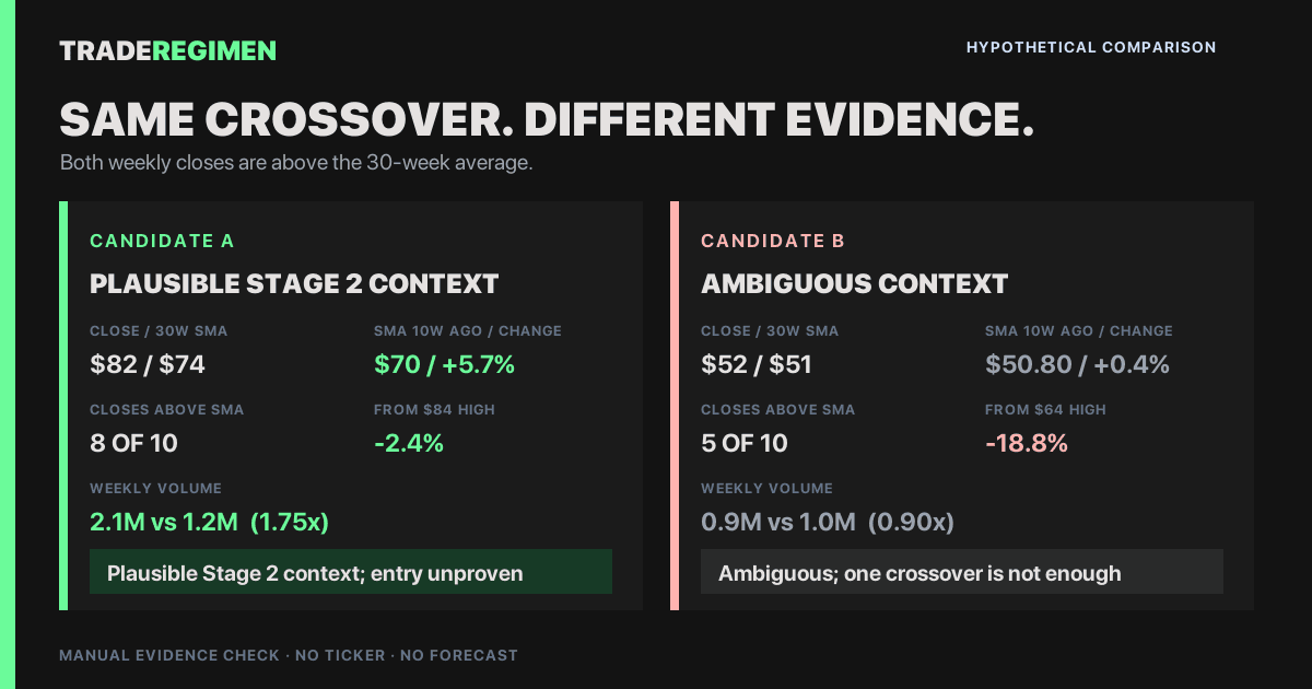
| Evidence | Candidate A | Candidate B |
|---|---|---|
| Weekly close | $82 | $52 |
| 30-week SMA | $74, up from $70 ten weeks earlier (+5.7%) | $51, up from $50.80 ten weeks earlier (+0.4%) |
| Recent structure | Eight of ten weekly closes above the average; $82 is 2.4% below the $84 range high | Five of ten weekly closes above the average; $52 is 18.8% below the $64 range high |
| Participation | 2.1M shares versus a 1.2M ten-week average (1.75x) | 0.9M shares versus a 1.0M ten-week average (0.90x) |
| Conclusion | Plausible Stage 2 context; entry still unproven | Method remains ambiguous; a rules-based tool may still show Stage 2 with a low rule-fit score |
These values and comparison thresholds are hypothetical and illustrate a manual review, not TradeRegimen's exact classifier branches. Neither row includes an entry trigger, stop, earnings date, liquidity check, or portfolio constraint.
Stage identifies the environment, not the entry
An early Stage 2 breakout and a late, extended Stage 2 chart can carry the same stage label while offering very different trade locations. A broad uptrend does not answer whether supply has contracted, whether the entry is close enough to invalidation, or whether the position fits the current market and portfolio.
Use Stage Analysis to decide whether a chart deserves deeper work. Then evaluate the actual structure with a method such as a volatility contraction pattern, compare relative strength, and calculate the risk from the planned stop before choosing shares.
How TradeRegimen applies the method
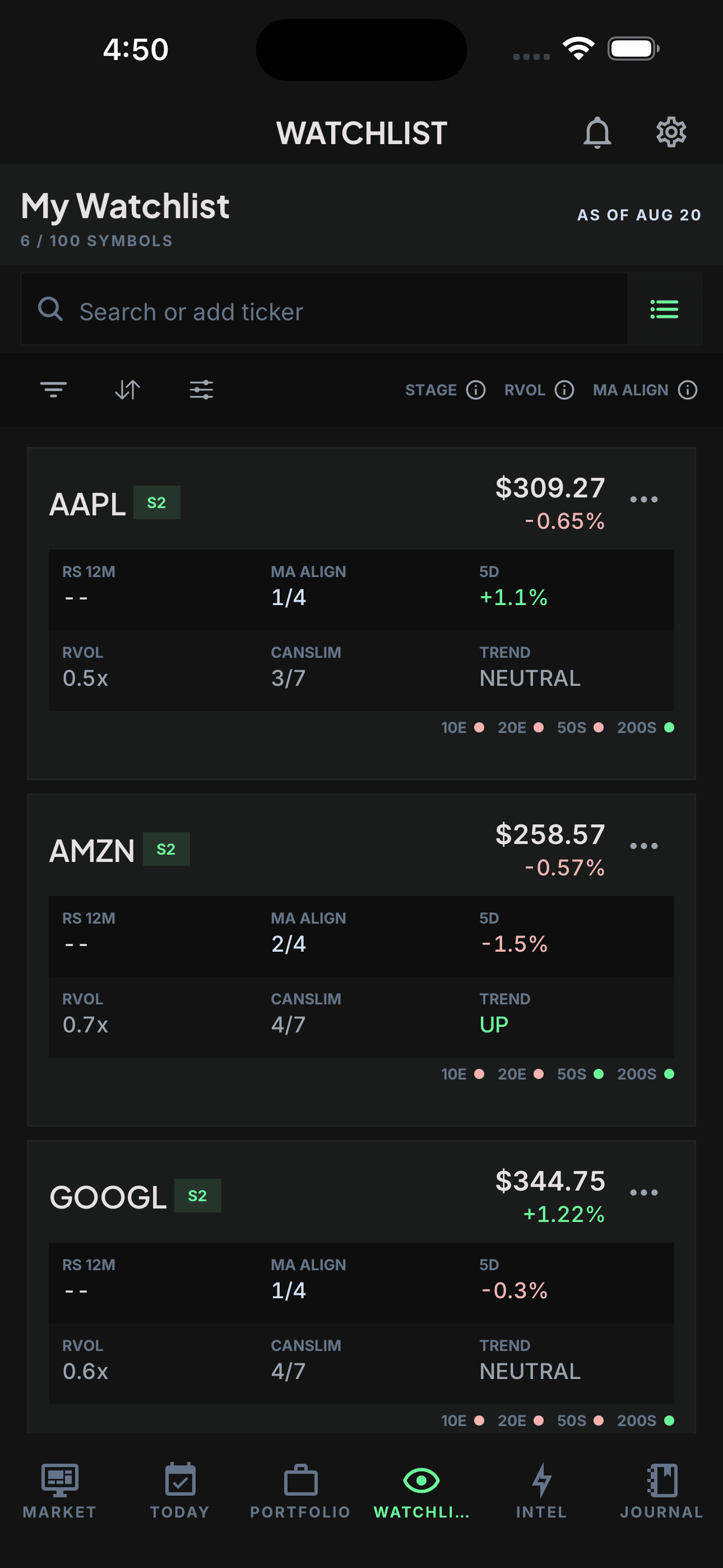
The Pro Watchlist can filter symbols by Stage 1 through Stage 4. Stage, relative strength, daily trend, relative volume, and moving-average alignment remain separate fields so one favorable label does not hide disagreement elsewhere.
Open a stock to inspect the longer-term Stage card. TradeRegimen shows the stage name, a rule-fit score, a written rationale, and underlying observations for price versus the 30-week average, average direction, range position, volume context, and sustained price action. The rule-fit score measures fit with this classifier; it is not a probability of profit or a forecast.
TradeRegimen can display an S2 badge with low rule fit when price is above the calculated average but stronger Stage 2 evidence is incomplete. Treat the badge as the beginning of the review, not as the same thing as a confirmed diagnosis. Different Stage tools may also disagree because their data, average types, slope windows, and thresholds differ.
Read the detail text rather than treating every check icon as bullish. The card summarizes directional context as bullish bias, bearish bias, or mixed. Those labels describe the stage heuristic; they are not brokerage instructions or individualized investment advice. The user still decides whether any setup, entry, and risk plan is valid.
TradeRegimen omits the active calendar week from this classifier so a partial week's volume is not compared with completed weeks. Check the data date: the stage view deliberately waits for the next weekly close rather than treating an in-progress bar as settled evidence.
Where Stage Analysis can fail
- Sideways markets: repeated crosses can make the stage unstable.
- Late trends: the average can keep rising after an entry has become extended.
- Limited history: a new listing may not have enough weekly data for a useful classification.
- Data differences: adjusted prices, corporate actions, missing bars, and cutoff dates can make tools disagree.
- Method differences: average type, slope window, range tests, and volume rules vary by implementation.
- Unseen risk: a chart label does not capture every earnings, liquidity, portfolio, or market-context constraint.
A useful next step
Choose one stock already on your research list. Inspect its weekly price against the 30-week average, describe the slope in plain language, and write down the evidence that would make the stage ambiguous. Then use the momentum watchlist guide to compare Stage with moving-average alignment and relative strength.
To see where this research step fits in the full decision process, open the TradeRegimen Start Here path.
Sources and review context
- Stan Weinstein, Stan Weinstein's Secrets for Profiting in Bull and Bear Markets, Dow Jones-Irwin, 1988. Bibliographic record.
- Charles Schwab, Understanding Simple Moving Average Crossovers, accessed September 13, 2026.
REVIEW NOTE
Published September 13, 2026 and reviewed against the current TradeRegimen Stage classifier, Watchlist filters, and Stock Detail interface. The four-stage framework is attributed to Weinstein; TradeRegimen's classifier is its own rules-based implementation, not a claim of exact reproduction. Educational information only, not individualized investment advice. Stage labels and market data can be delayed, incomplete, or wrong. Read the full disclaimer.
FREQUENTLY ASKED
Is a 30-week moving average the same as a 150-day moving average?
They are rough analogues, not identical calculations. A weekly average uses weekly closing observations, while a 150-day average uses daily closes. Holidays, partial weeks, and the averaging sequence can produce different values. TradeRegimen's main Stage classifier uses weekly bars and a 30-week simple moving average.
Does relative strength mean RSI?
No. Relative strength compares a stock's performance with a benchmark or universe. RSI is a bounded momentum oscillator based on the stock's own recent gains and losses. They answer different questions.
Run your trading like a system.
Build your Constitution, check a manual position plan when you log it, and review rule states while recorded positions are open.
Get Started